


There are also so many ways different metal products that you can chose from no matter your personal style! I posted about how to work metals into your décor HERE last week, and I got some questions regarding the different finishing choices that you can select. It can be overwhelming so I decided to post and share with you which finishes that I like and why and to visually show you the differences! Sometimes with choices it can be overwhelming on which one to choose and of course I weighed in on which are my favorites are why. All the metal finishes are amazing but I would use different ones on different occasions depending on the decor setting. And because videos sometimes are waaaayyy easier I threw together a quick video to summarize it all!
All prints show here were printed with Black River Imaging. (KDP5 for 20% off first order)

Below is all the different choices Metallic Fade Gloss(top left) and Metallic Fade Matte(top right) then you haveVibrant Gloss(bottom left) and Vibrant Matte(bottom right). In general, when choosing a Metal Print finish, first determine how you want your image colors to look in the final product. Do you want your colors to be accurate and true? Choose Vibrant. Do you want colors that look vintage and show the metal surface? Choose Metallic Fade.

I am a chart kinda gal… aka visual. See this graphic below to show you the differences. To show the true colors in your image, Vibrant metal prints start with a white base coat and then your image is printed over that. With that white base, Vibrant prints can bring all your colors to life.
Metallic Fade prints have no base coat. This means Metallic Fade prints will not show white areas of your image; instead the metallic surface will be revealed in these lighter areas. The quality of revealing the metal surface subdues the overall colors in the image, lending it a vintage, aged look.
• Vibrant Matte – I put this one first because it is my personal favorite and aligns with my brand and style the most. My décor style is more light and airy and the Vibrant Matte is a perfect pop of color on metal.
• Vibrant Gloss- So if you style is more modern or if you have bold accents of color in your décor this Vibrant Gloss would be the perfect pairing. It is a color but the gloss takes it up a notch to enhance all the colors and details.
• Metallic Fade Matte- The Metallic Fade Metals are amazing for black and white or sepia images! Especially for images that have a lot of the depth. Where you would normally see whites or light colors, it shows the metal surface and is a statement piece in décor for sure.
• Metallic Fade Gloss- Again I love these for black and white photographs or for even landscape photography that the colors tend to be subtle. If the metal print is going in a modern space with other gloss finishes in the room this is your perfect selection
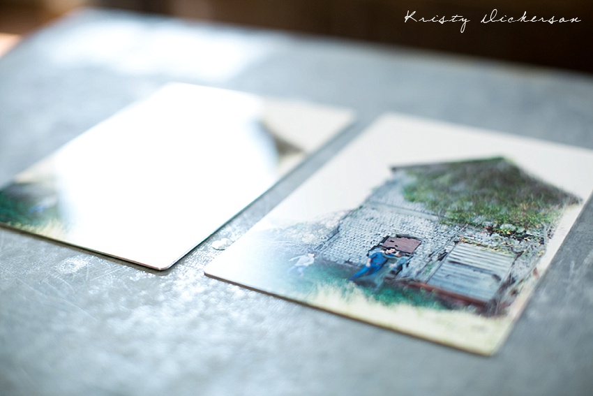
It is extremely hard to show the different finishes and to show the texture and characteristics. One characteristic that the gloss has is although it is richer in color it also tends to reflect light. See this image below. Both pictures are Vibrant prints but the surface finish is on the left is Gloss(which is reflective) and on the right is matte.


